GOAL
Build rapport and favorability within the market to promote future growth.
SOLUTION
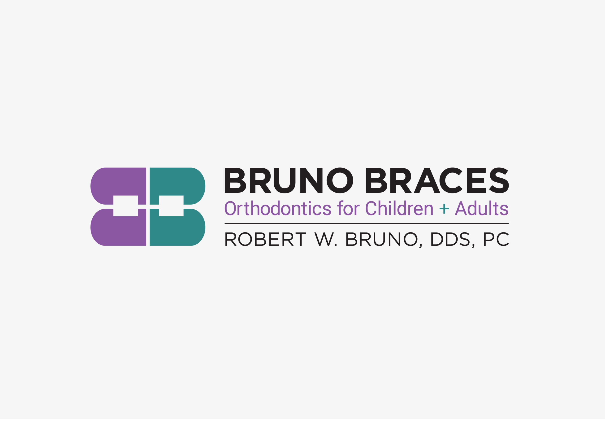
Create a stylish logo that utilizes the brand name and is symbolic with the use of the two letters in Bruno Braces. Alongside graphic elements that depict braces in a fun and sophisticated way.
DELIVERABLES
BRAND IDENTITY
BRAND STRATEGY
CREATIVE CONSULTING
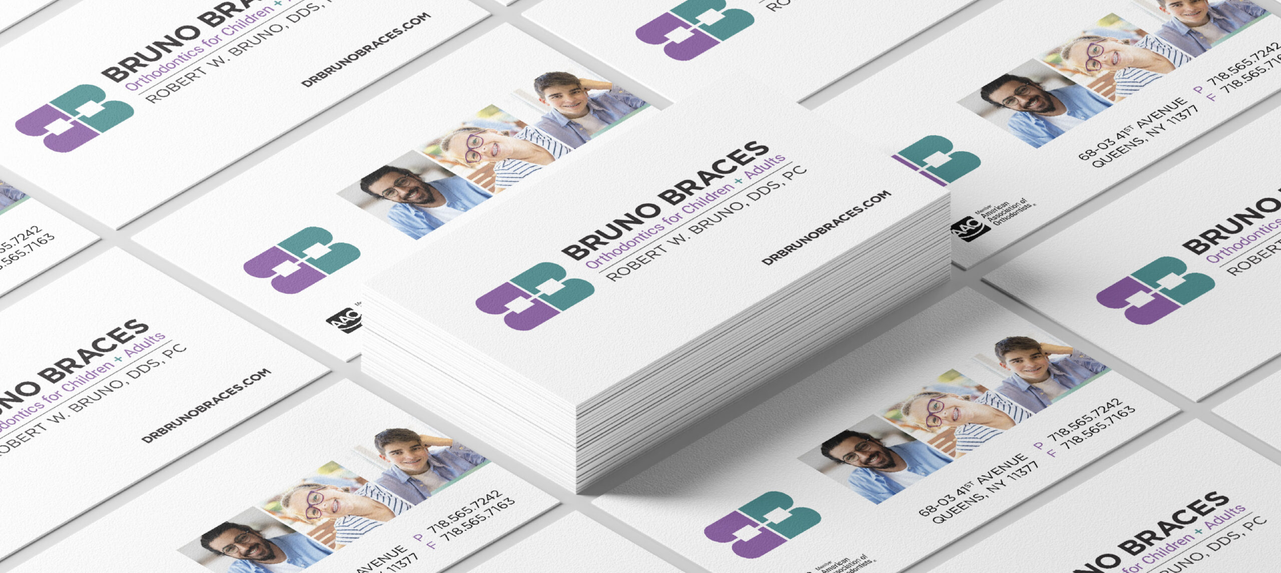
STATIONERY

ABOUT BRUNO BRACES
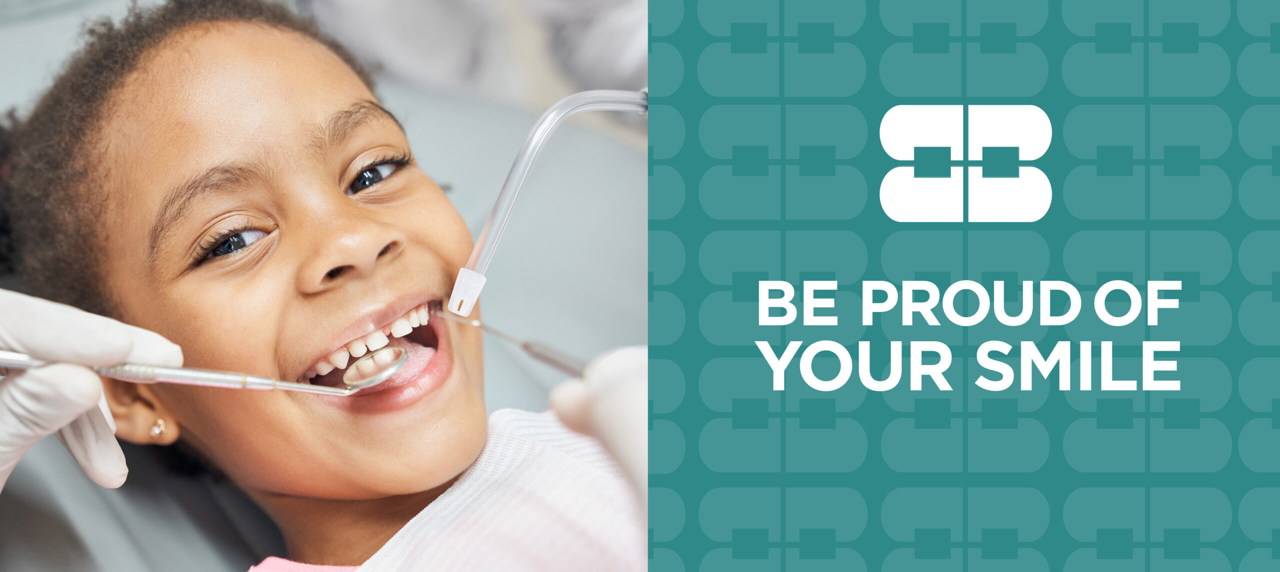
Bruno Braces provides one-to-one care to ensure their patients have the best orthodontic experience and the strongest results in a timely manner. It’s important that their team get to know you, not as a number on a chart or a mouth in the exam chair, but as a person. Their team wants you to enjoy your orthodontic journey. They offer gentle, professional care that will change your smile and transform your life.
SOLUTION
Modernize the existing dental practice. Robert W. Bruno, DDC, PC is a specialist in orthodontics and dentofacial orthopedics, providing braces to children and adults. The existing brand became Bruno Braces which resonates on an emotional level and fulfills its commercial purpose. A new logo was created symbolically with the use of the two letters in Bruno Braces alongside graphic elements that depict braces in a fun yet sophisticated way. The color palette evolved to purple and green to add some energy and excitement to the brand. Once the new brand identity and guidelines had been established, assets and brand elements were weaved throughout the website, signage, stationery and office interior. Holistically, the new brand served to elevate the practice to stand out, connect with audiences and make it recognizable.
The new modernized Bruno Braces brand has resulted in new clients, revenue growth and customer satisfaction.
ADDITIONAL CASE STUDIES
Click an image below to view more case studies.